Is baar har paragraph 50 words se chhota rakha hai, aur FAQ ke questions ab alag H3 headings hain taake koi bhi cheez ek bade block mein na jude. SEO title, meta description aur slug pehle wale hi hain.
Tone on Tone Embroidery Digitizing: 5 Proven Tips for Subtle, Premium Results
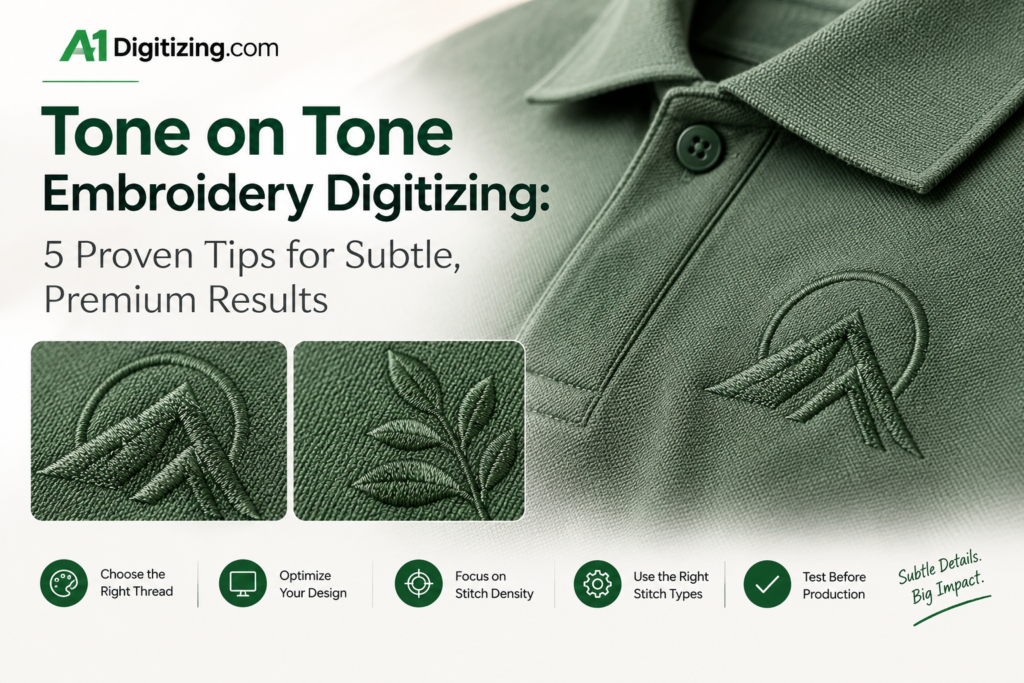
Tone on tone embroidery digitizing is the process of building a stitch file where the thread color sits very close to the fabric color. The logo shows up through texture and sheen rather than bold contrast.
It is the quiet, understated side of embroidery: a navy logo on a navy polo, or a charcoal crest on a grey jacket.
Many premium brands choose this look when they want branding that feels refined instead of loud. The catch is that subtle designs leave no room for error.
Without strong color contrast to hide behind, every stitch angle, every density decision, and every underlay choice shows.
This guide explains how tone on tone embroidery digitizing works and shares 5 proven tips for getting it right.
What Is Tone on Tone Embroidery?
Tone on tone embroidery uses thread in the same color family as the garment, usually one to three shades lighter or darker.
Instead of the logo “popping” through contrast, it reveals itself as light catches the raised thread, creating a soft shadow-and-sheen effect. It is closely related to a monochrome approach to design, where variation comes from tone and texture rather than from different hues.
Because the effect depends on how thread reflects light, digitizing choices matter far more than they do on a high-contrast logo.
A flat, evenly filled design can disappear completely, while a well-digitized one looks rich and dimensional.
Why Tone on Tone Embroidery Digitizing Is Harder Than It Looks
On a standard two-color logo, color does most of the visual work. With tone on tone embroidery digitizing, it flips: stitch structure becomes the design.
A few things make it more demanding:
- Low contrast hides detail. Fine lines and small gaps that would be visible in contrasting thread simply vanish in a close shade.
- Fabric show-through is more noticeable. Thin coverage reveals the fabric color underneath, which can make the tonal effect look patchy.
- Uneven stitching is exposed. Small tension or density inconsistencies create visible blotches because there is no contrast to mask them.
5 Proven Tone on Tone Embroidery Digitizing Tips
1. Choose the Right Shade Difference
The most common tonal mistake is picking a thread that is too close to the fabric. If the shade difference is too small, the logo disappears; too large, and it stops being tone on tone.
A good rule of thumb is a thread two to three shades lighter or darker than the garment, in the same color family.
A lighter thread tends to read as a soft highlight, while a darker thread reads as a subtle shadow. Share exact thread numbers with your digitizer rather than describing a color like “dark blue.”
2. Let Texture Do the Work
Since color contrast is limited, texture carries the design.
A skilled digitizer varies stitch types and directions so that different parts of the logo catch light differently: satin stitches for bold letters, directional fills for larger shapes, and angled stitch patterns that create gentle shading.
Changing the stitch angle between neighboring areas is one of the simplest ways to make a tonal design look dimensional instead of flat.
3. Use Underlay and Density to Build Subtle Relief
Underlay is what gives tonal embroidery its quiet raised look. A well-built underlay lifts the top stitches slightly so they cast tiny shadows, which is exactly the contrast a tonal logo relies on.
Density needs balance: enough coverage so the fabric does not show through, but not so heavy that the design turns stiff or puckers the garment.
Lighter fabrics like polo piqué need a more delicate approach than structured jackets or caps, which is why good tone on tone embroidery digitizing always starts with knowing the fabric.
4. Keep Detail Bold and Simple
Fine detail is the first casualty of low contrast. Thin outlines, tiny text, and intricate shading often become unreadable in tonal thread.
Simplify the artwork where you can: use thicker strokes, larger lettering, and clean shapes with clear spacing.
If your logo includes small text, flag it early so your digitizer can recommend a size or simplification that keeps it legible.
5. Always Request a Test Stitch-Out in Real Lighting
Tonal embroidery looks different under different lights.
A design that looks perfect in a screen preview can look flat in a showroom and sharp outdoors.
Ask for a test stitch-out on the actual fabric, then view it in daylight and indoor lighting before approving a bulk run.
This step alone prevents most expensive mistakes, especially for uniform programs where hundreds of garments depend on one approved file.
Best Garments and Placements for Tone on Tone Embroidery Digitizing
Tone on tone embroidery digitizing works best where a refined, low-key brand presence is the goal:
- Polo shirts and button-downs: a left-chest logo in a close shade reads as premium and professional.
- Quarter-zips, jackets, and fleece: thicker fabrics support dimensional stitching well.
- Caps: a tonal front logo gives a clean, modern look, especially on structured styles.
- Hoodies and sweatshirts: oversized or centered tonal designs give a streetwear-inspired feel.
Heavily textured fabrics, like thick waffle knits, can swallow tonal detail. These usually need larger, simpler designs.
Common Tone on Tone Embroidery Digitizing Mistakes
- Picking a thread that is too close to the fabric color, making the logo nearly invisible
- Using the same stitch direction everywhere, which flattens the design
- Skipping the test stitch-out, then discovering the effect is too faint on the finished garment
- Over-densifying the design to make up for low contrast, causing stiffness or puckering
- Keeping tiny details from the original artwork that cannot survive tonal thread
How to Prepare Your Tone on Tone Embroidery Digitizing Order
To get a reliable result, send your digitizer clear information from the start:
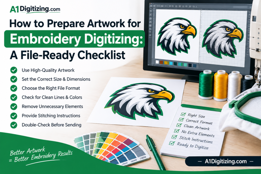
- A high-resolution or vector logo
- The garment type and fabric
- Exact fabric and thread colors, if you have them
- The placement and size you want
Color accuracy matters even more here than usual, because the difference between a thread that works and one that fails can be a single shade.
For a deeper look at how hue, shade, and lightness relate, the basics of color theory are a helpful reference when planning a tonal palette.
If you are planning a uniform or workwear program with a tonal logo, see our guide to uniform embroidery digitizing for tips on keeping results consistent across large batches.
Frequently Asked Questions About Tone on Tone Embroidery Digitizing
Is tone on tone embroidery more expensive than regular embroidery?
The stitching itself costs about the same. Digitizing can take slightly longer because of the extra attention to underlay, stitch direction, and test stitch-outs.
Can any logo be turned into a tone on tone design?
Most can, but simple logos with bold shapes and clear spacing work best. Highly detailed logos may need simplification first.
What fabric color works best?
Mid-tone and darker garments usually show tonal embroidery most clearly. Very light fabrics can need a slightly deeper shade difference to stay visible.
Do I need a test stitch-out every time?
For a new design, yes. For reorders that use an approved file on the same fabric, it is usually not needed.
Final Thoughts
Tone on tone embroidery digitizing rewards careful decisions. When the shade, stitch texture, underlay, and density all work together, the result is a quiet, high-end logo that looks far more expensive than its simplicity suggests.
When any one of them is off, the design simply disappears. Working with a digitizer who understands how thread catches light is the difference between the two.
If you want a subtle, premium logo from tone on tone embroidery digitizing on your next order, get in touch with our team or place your order directly.
You can also review our price list, or explore our logo digitizing and badge embroidery services for more options.
Subtle branding is becoming a signature of premium apparel, and the brands that get it right treat digitizing as part of the design, not an afterthought.
With tone on tone embroidery digitizing, one well-chosen shade and a carefully built stitch file can turn an ordinary garment into something that feels custom-made. Start with one tonal piece, test it in real light, and build from there.